The Circle, the Square, and the Triangle Walk Into a Brand Meeting
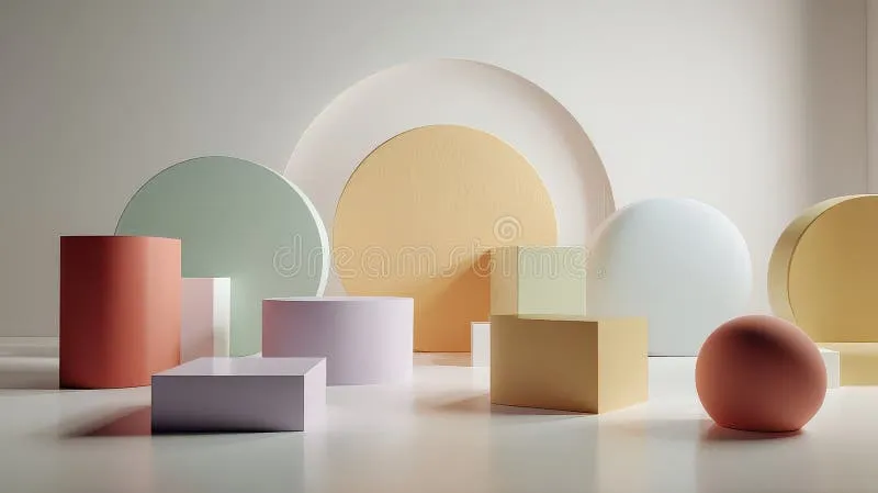
Photo: geometric minimalist shapes colorful design studio workspace, via thumbs.dreamstime.com
Geometry Was Never Just for Math Class
There's something almost embarrassing about admitting that the most sophisticated design work happening right now traces its DNA back to the kind of shapes a five-year-old draws with a crayon. A circle. A square. A triangle. Three forms so basic they're practically prehistoric — cave painters were working with them tens of thousands of years ago — and yet they're quietly running the visual world around us.
Walk through any American city today and look up. The logos on coffee cups, the icons on your phone's home screen, the signage outside your gym — strip away the color and the typography, and you'll find geometry doing the heavy lifting. This isn't laziness on the part of designers. It's actually one of the hardest creative moves to pull off well: using almost nothing to say almost everything.
At Figure Playground, shapes are kind of our whole deal. So let's get into why the simplest ones carry so much weight.
Your Brain Already Knows What Shapes Mean
Here's the thing about geometric minimalism that makes it genuinely powerful rather than just trendy: it's not arbitrary. Human beings are hardwired to process basic shapes faster and more emotionally than complex imagery. Psychologists call this "prototypicality" — our brains recognize simple, symmetrical forms almost instantly, which frees up cognitive bandwidth to feel something rather than just decode something.
Circles read as safe, continuous, and friendly. Think about how many healthcare brands, children's platforms, and community-focused organizations lean into rounded forms — there's a reason the Targets and the Spotifys of the world aren't built on sharp angles. Squares and rectangles communicate stability, reliability, and structure. Your bank probably has a lot of rectangles in its visual system. Not an accident.
Triangles are the wildcards. Point them up and they suggest ambition, momentum, direction. Flip them over and suddenly there's tension, disruption, a sense of precariousness. Plenty of tech startups have weaponized exactly that energy — a visual language that says we're moving fast and we're not apologizing for it.
Understanding this psychological shorthand isn't about following rules. It's about knowing which emotional notes you're playing before you even pick up a stylus.
The Brands That Stripped Everything Back
Look at the evolution of some of America's most recognized visual identities and you'll see a consistent pattern: over time, they get simpler. More geometric. More abstract.
Apple's logo journey is the classic example — from a detailed illustration of Isaac Newton under a tree to one of the most recognizable silhouettes on the planet. But the geometric minimalism story goes deeper than Silicon Valley. The NBA's logo is essentially a red, white, and blue silhouette — a figure reduced to its most essential motion. FedEx hides an arrow between two letterforms. Instagram moved from a detailed camera illustration to a bold, flat geometric shape. Each of these moves traded literal representation for something more potent: pure visual signal.
Nike's swoosh is arguably the ultimate case study. It's a single curved stroke — barely a shape at all — and yet it communicates movement, speed, and aspiration so effectively that the company eventually dropped its own name from the logo entirely. The geometry did the work the words no longer needed to do.
What these brands figured out, often after years of visual complexity, is that restraint is its own kind of boldness.
Playing With Negative Space and the Shapes In Between
One of the most exciting places geometric minimalism lives isn't in the shapes themselves — it's in the spaces between them. Negative space is where simple geometry gets genuinely playful.
When designers at Figure Playground talk about building with basic shapes, we're not just talking about the filled forms. The gaps, the overlaps, the cutouts — these create secondary shapes that reward the viewer for looking longer. It's the visual equivalent of a good joke with a delayed punchline.
Try this exercise: take three circles of different sizes and overlap them. Now look at what's created in the spaces between them. Those secondary forms are yours to work with. Adjust the opacity of one circle and the overlapping region becomes a new tone, a new shape, a new meaning. Suddenly your three circles are a constellation of possibilities.
This is how designers like Saul Bass built entire visual languages from almost nothing — and why his work for films like Vertigo and Anatomy of a Murder still looks contemporary decades later. The shapes were simple. The relationships between them were endlessly complex.
Practical Ways to Simplify Without Going Flat
If you're a designer looking to bring more geometric restraint into your work, the challenge isn't usually the simplification itself — it's trusting that the simplification is enough. Here are a few approaches worth experimenting with:
Start with the silhouette test. If your design concept doesn't read clearly as a solid black shape on a white background, it's carrying too much detail. The most durable geometric marks survive this test easily.
Limit yourself to three shapes max. Constraints breed creativity. Giving yourself a rule — this identity can only use circles and rectangles, for example — forces you to find meaning within limitation rather than reaching for complexity when you get stuck.
Let alignment do the storytelling. How shapes relate to each other spatially — stacked, offset, nested, fragmented — creates narrative without adding visual clutter. A square sitting inside a circle says something different than a square breaking out of one.
Color last. Build your geometric system in black and white first. If the forms work without color, color will only amplify them. If you need color to make the design make sense, the shapes aren't doing enough work yet.
Why Simple Will Never Go Out of Style
Geometric minimalism isn't a trend cycle — it's a return that keeps happening because it keeps working. Every generation of designers discovers it fresh, applies it to new contexts, and arrives at the same conclusion: the shapes we learned before we could read are the ones that speak most directly to something pre-verbal in all of us.
At its best, minimalist geometry isn't about doing less. It's about doing exactly enough — finding the precise configuration of circles, squares, and triangles that makes someone stop, look, and feel something before they can even explain why.
That's not a stick figure. That's the whole game.