Still Images That Won't Sit Still: Your Guide to Designing Motion Into Static Art
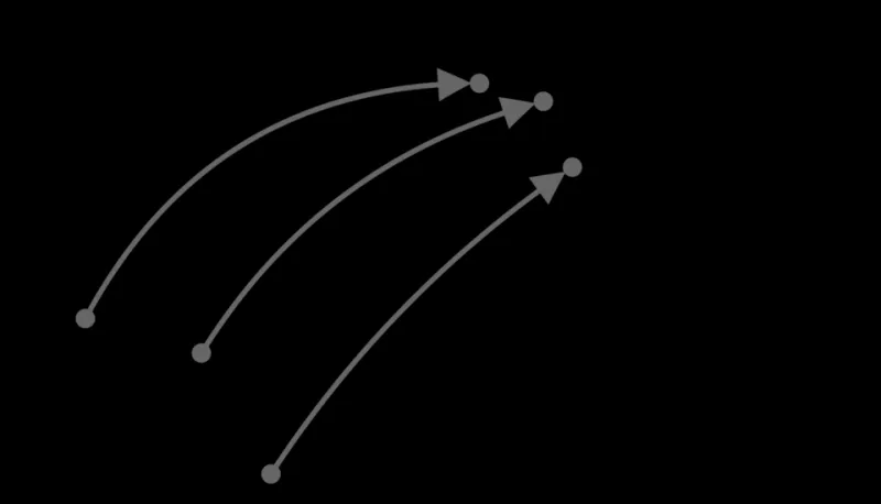
Photo: Alexis Tantet, CC BY-SA 4.0, via Wikimedia Commons
The Frozen Frame That Refuses to Freeze
You've seen it before. A poster on a subway wall, an illustration in a magazine, a digital artwork on your feed — and something about it feels alive. Your eye keeps moving. The image seems to shift, hum, breathe. You look away and look back, half expecting it to have changed.
It hasn't, of course. It's a static image. Pixels or ink on a surface, completely inert. But your brain doesn't fully buy that, and the designer responsible for that piece knew exactly what they were doing.
Creating the illusion of movement in still work is one of the most satisfying skills in a visual artist's toolkit. It's also one of the most misunderstood — often chalked up to vague concepts like "energy" or "dynamism" when the reality is far more specific and learnable. There are actual techniques at play, rooted in perception science and refined over centuries of art-making. Let's break them down.
Why Your Eyes Lie to You (Happily)
Before getting into the how, it helps to understand the why. Human vision isn't a camera. Your eyes don't capture a scene objectively — your brain actively constructs what you perceive, filling in gaps, anticipating movement, and making assumptions based on visual patterns it recognizes from lived experience.
This is the foundation of every kinetic illusion in static design. You're not tricking someone's eyes. You're handing their brain a set of familiar visual cues — cues that normally accompany real motion — and letting it do the rest of the work.
The brain sees diagonal lines and expects things in motion. It sees radial patterns and perceives spinning. It sees a figure mid-stride and unconsciously "completes" the movement forward. These aren't bugs in human perception. They're features that designers get to exploit.
Line Direction: The Unsung Driver of Visual Energy
If you only take one thing from this guide, let it be this: the angle of your lines controls the perceived speed of your image.
Horizontal lines are calm. Think of a flat horizon, a body at rest, a landscape at dawn — nothing is happening, and that stillness feels intentional and peaceful. Vertical lines step up the energy slightly — they suggest standing, readiness, structure. But diagonal lines? Diagonals are kinetic by nature. They imply trajectory. Something going somewhere.
The steeper the diagonal, the more urgent the implied motion. This is why action comics and sports photography both lean so heavily on diagonal compositions — it's not an aesthetic preference, it's a physiological response. Your nervous system reads steep angles as things in motion.
Try this: Take any illustration you're working on and rotate the primary elements five to fifteen degrees off horizontal or vertical. Notice how the energy of the piece changes without a single other adjustment. That's line direction doing its job.
For more advanced work, consider competing diagonals — lines that angle in opposing directions create visual tension that reads as collision, turbulence, or conflict. Converging diagonals create the sensation of rushing toward a vanishing point. Both techniques are powerful tools for illustrators who want their static work to feel like it's mid-action.
Blur, Smear, and the Vocabulary of Speed
Motion blur is one of those things we all recognize from photography and video, which means our brains have been thoroughly trained to associate it with movement. When a still image borrows that language — elongated edges, smeared forms, trailing ghost shapes — the perception of speed follows automatically.
This is why you'll see so many contemporary illustrators and digital artists building blur into their work deliberately. It's not a filter slapped on as an afterthought. It's a compositional decision about how fast something is moving and in what direction.
Smear frames are a technique borrowed directly from traditional animation. When animators needed to convey extreme speed between keyframes, they'd draw a single "smear" frame — a distorted, stretched version of the figure that exists for just a fraction of a second on screen. In static work, that smear frame becomes the whole image. The figure is simultaneously in two positions at once, and your brain reads that overlap as motion.
You'll see this technique everywhere once you know to look for it — in skate culture graphics, in music poster art, in the work of illustrators like Eric Canete and Yuko Shimizu, where figures and objects seem to be moving faster than the image can contain them.
Negative Space as a Motion Tool
Negative space — the empty areas around and between your subjects — is usually discussed in terms of balance and composition. But it's also one of the most underused tools for creating the sensation of movement.
Here's the principle: leave more negative space in front of a moving figure than behind it. This gives the subject visual "room to move into," and your brain perceives the implied trajectory even though nothing is actually moving. A figure with empty space ahead of them feels like they're going somewhere. The same figure with empty space behind them feels like they just arrived — or like they're about to stop.
This is true for objects, type, abstract forms — anything with a perceived direction of travel. Point it into open space and it accelerates. Box it in and it stops.
Repetition and Rhythm: Making the Eye Dance
One of the oldest kinetic tricks in visual art is repetition — using multiple versions of a form, slightly shifted or rotated, to imply a sequence of positions over time. You're essentially showing several frames of an animation simultaneously.
You can see this in Futurist paintings from the early twentieth century, like Giacomo Balla's Dynamism of a Dog on a Leash, where the dog's legs and tail are painted in multiple positions at once to capture the blur of walking. The same principle shows up in modern motion graphics and UI design when designers use "ghost" or "echo" shapes to show where something was before it arrived at its current position.
Rhythm works similarly. When visual elements repeat with consistent spacing and variation — think a series of arcs that get progressively larger, or a pattern of marks that accelerates toward a focal point — the eye follows that rhythm like a beat, and the sensation of movement through the composition is undeniable.
A Quick Before-and-After Exercise
Here's a simple experiment to put all of this into practice at once:
- Draw or place a basic figure — a person, an animal, a simple abstract shape — in the center of your canvas, upright, symmetrically framed with equal space on all sides.
- Note how static it feels.
- Now: rotate the figure 10–15 degrees. Shift it to one side, leaving more negative space in front of it. Add a few motion-blur lines trailing behind its dominant edge. If it's a figure, put it mid-stride rather than standing still.
- Compare the two versions.
The subject is identical. The information is the same. But one version sits on the page and one version moves through it.
That's the whole magic trick — and now you know how it's done.
Motion Is a Feeling, Not a Feature
The best kinetic static work doesn't announce itself. You don't look at a great illustration and think, "Ah yes, strategic diagonal line work." You just feel the energy and keep looking. The technique disappears into the experience.
That's the goal every time you sit down to create something here at Figure Playground. Not to show off the tools, but to make something that moves people — even when it can't move at all.