More Is Less: The Designer's Secret Obsession With Breathing Room
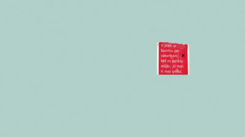
Let's say you've got a design layout in front of you. You've got a headline, a subhead, a product image, a call-to-action button, some supporting copy, a logo, and maybe a little badge that says "New Arrival." It feels complete. It feels full. And that, right there, is the problem.
Full is not the same as strong. And in the world of visual design, there's a strange kind of math at play — one where subtracting actually multiplies impact.
The Illusion of More
Human brains are wired to equate density with value. More words on a page must mean more information. More design elements must mean more effort. More stuff must mean more worth. It's the same instinct that makes us pile our plates at a buffet even when we're not that hungry.
But here's where designers who really get it start to diverge from the crowd: they've trained themselves to see emptiness as a tool, not a failure. Negative space — the area in a composition that isn't occupied by a focal element — isn't leftover. It's intentional. And when used well, it does something no element you could add ever could: it tells the viewer's eye exactly where to go.
When everything is competing for attention, nothing wins. When one thing has room to breathe, it commands the whole frame.
The Math Nobody Talks About
Designers have been quietly obsessed with mathematical ratios for centuries. The golden ratio (approximately 1:1.618) shows up in classical architecture, Renaissance painting, and yes, modern brand identity work. But you don't need to run equations to understand the underlying principle: proportional relationships between elements and the space around them create a visual rhythm that feels right even when viewers can't explain why.
Take the rule of thirds — divide any composition into a 3x3 grid and place your key elements near the intersections. The magic isn't in the elements themselves; it's in the negative space that surrounds them and creates visual tension between those points. Strip that breathing room away and pack the grid edge to edge, and the tension collapses. Everything flattens out.
Typographers call the space between lines "leading" and the space between letters "tracking." Mess with those values and the same words can feel urgent or relaxed, premium or bargain-bin. The words didn't change. The space did.
Case Study: When Brands Got Brave Enough to Remove
Some of the most striking brand redesigns in recent memory didn't add anything. They deleted.
Think about the quiet evolution of luxury fashion logos — brands like Burberry, Balenciaga, and Saint Laurent all stripped back ornate, detailed wordmarks in favor of clean, wide-set lettering with generous negative space. The reaction from the internet was predictably loud and mostly negative at first. People called it lazy. Boring. Generic. But look at those logos on a phone screen, on a bag, on a billboard — they're instantly readable, quietly powerful, and they age in a way that dense, intricate logos simply can't.
Or zoom out to tech. Apple's design philosophy has long leaned into restraint. Their product pages are famous for vast white space, a single hero image, and copy that doesn't overstay its welcome. That emptiness isn't accidental — it signals confidence. It says: this product doesn't need to fight for your attention. It already has it.
Contrast that with a cluttered retail flyer stuffed with competing sale callouts, mismatched fonts, and seventeen different things all screaming at equal volume. You've seen them. You've probably ignored them.
Why Designers Keep Falling Into the Fullness Trap
So if breathing room is so powerful, why do so many designs end up overcrowded? A few reasons:
Client pressure is real. The note "can we add just one more thing?" is practically a design industry meme at this point. When someone is paying for a full-page ad, they often feel like every inch needs to be earning its keep. The idea that a big blank area is working for you is a genuinely hard sell.
Insecurity fills space. When designers aren't confident in their core concept, they compensate by adding. More texture, more elements, more visual noise — all of it quietly masking the uncertainty underneath. Restraint requires conviction.
We conflate effort with complexity. A minimal layout looks easy. It doesn't look like it took forty-seven iterations to land on. But stripping a design down to its essential bones is almost always harder than building it up.
How to Start Using Space Like a Pro
You don't need to go full Swiss minimalism to start applying this. A few practical shifts:
Give your focal element a buffer zone. Whatever your hero element is — a headline, a product, a face — give it more surrounding space than feels comfortable. Then give it a little more. You'll be surprised how much stronger it reads.
Audit for visual noise. Go through your layout and ask of every single element: is this earning its spot? Decorative dividers, redundant subheads, stock icons that don't add meaning — cut them first and see what's left.
Let margins do the heavy lifting. Generous margins aren't wasted space. They're a frame. They tell the viewer that what's inside is worth looking at carefully.
Resist the urge to fill the silence. In music, a rest is as important as a note. In design, an empty area creates anticipation, directs the eye, and gives what's there room to resonate.
The Confidence Play
There's something almost philosophical about negative space in design. It asks you to trust that less is enough — that the work you've done is strong enough to stand without reinforcement from every direction. That's a vulnerable place to be, especially when you're presenting to a client or posting to a platform where first impressions happen in milliseconds.
But here's the thing: viewers feel that confidence. A layout that gives itself room to breathe signals that whoever made it knew what they were doing. It's the visual equivalent of a speaker who pauses before the punchline instead of rushing through it.
More isn't more. It never really was. The designers who've figured that out — the ones who can walk into a review and defend the empty space with the same conviction they'd defend the elements — those are the ones whose work keeps stopping people mid-scroll.
Make room. It'll speak louder than anything you could put there.