Silhouette, Snap, and Color Block: A Designer’s Guide to Reading the Toy Aisle
Walk down any toy aisle in the US and you are basically walking through a design review. Every figure is trying to do the same job your poster, character sheet, or brand mark has to do: read instantly, feel specific, and make somebody care. The difference is that toy designers have about three seconds and a blister pack to pull it off.
That makes action figures a weirdly useful classroom. Not because you need to collect them, but because they compress the big questions of character design into something you can hold in your hand. Silhouette, color blocking, articulation, accessories, packaging — it is all there, shouting or whispering depending on how well the figure was made.
Why the shelf beats the mood board
A mood board shows you what a designer liked. A figure shows you what a designer had to solve. The shape has to survive molding. The paint has to survive play. The joints have to move without turning the character into a broken stick figure. The package has to sell the fantasy before the buyer ever touches the plastic.
That constraint is the lesson. Good figures are not just sculptures. They are arguments about who a character is, made in plastic. A cape that flares like a warning flag. A helmet that hides the eyes because mystery is the point. A tool clipped to a belt so you know the job before you know the name.
The five signals worth studying
Start with silhouette. Squint at the figure from across the room. If you cannot tell who it is, the shape is doing too little or too much. Strong character design usually has one dominant gesture: a wide stance, a heavy shoulder, a long coat, a ridiculous hat. The silhouette is the headline.
Then look at color blocking. Ignore the tiny paint details for a second. What are the three biggest color areas? Do they create hierarchy, or just noise? A lot of great figures use one warm color to pull your eye to the face or weapon, then let the rest of the body recede. If you turn the figure grayscale and it turns to mush, the values are not pulling their weight.
Articulation is next, and it is the most underrated design element. Joints are interruptions. The best figures hide or justify those interruptions so the body still reads as one flowing shape. When a cut lands in the middle of a color block for no reason, your eye snags. When it lands on a seam or costume line, it disappears.
Accessories tell you what the character does. Not what they wear — what they do. A tiny wrench, a camera, a sword, a clipboard, a cup of coffee. The prop is a story prompt. If a figure comes with five accessories and none of them clarify the character’s role, that is a packaging problem disguised as generosity.
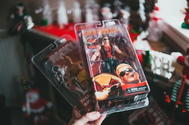
Finally, packaging. The box is a poster with a job. It frames the figure, sets the mood, and tells you who this character is before you have even opened anything. Look at where the logo sits, how much empty space the designer used, and whether the copy sounds like the character or like a committee.
A collector case study: the six-foot read
I talked with Marcus, a collector in Columbus, Ohio, who displays his figures on open shelves in a home office. His rule is simple: every figure has to read from six feet away. Up close, he wants paint and detail. From across the room, he wants attitude.
He rotates his shelf every few months, and he uses the same test a graphic designer might use on a logo. He backs up until the details vanish. If the character turns into a generic blob with a gun, the pose is not doing enough. If the shape still says 'sneaky bounty hunter' or 'tired space dad,' the design is working.
Marcus also admitted that he used to buy figures for accessories and then pose them badly. Now he treats posing like typography. The figure gets a clear line of action, one strong angle, and enough negative space around it to breathe. 'A shelf full of stiff figures is like a paragraph with no spacing,' he said. 'You can’t see anything.'
What a character designer looks for
I also spoke with Nadia Ruiz, a character designer who has worked on animation pitches and collectible concepts. She said the action figure test is one of the fastest ways to find out whether a design has bones.
'You can hide a lot in a drawing,' she told me. 'You cannot hide a weak silhouette in a toy. The body has to work as a shape first. Then the costume has to work as color. Then the accessories have to work as story.'
Her checklist for whether a figure feels alive is refreshingly unglamorous. Does the pose imply a next action? Do the hands look like they could grip something? Is there asymmetry somewhere — a tilted head, a raised shoulder, a hip shifted to one side? Is there one detail that feels specific rather than generic? 'Alive' is usually just 'specific' with better lighting.
Self-audit: read your own shelf
Pick one figure line you own or admire. You do not need a huge collection. Three figures are enough. Run this audit and write down what you notice.
- Silhouette test: Squint or back up six feet. Can you identify each character by shape alone? Which one reads fastest? Which one turns into a blob?
- Color hierarchy: List the three largest color areas. Is there a clear focal point? Does the figure still read in grayscale?
- Articulation rhythm: Trace the body outline. Do the joints interrupt the shape, or do they follow seams and costume lines?
- Accessory story: What does each accessory tell you about the character’s job, mood, or world? Which prop is doing the most narrative work?
- Packaging voice: Read the box copy and look at the layout. Does it sound like the character, or like a product description? Where does your eye land first?
- Pose language: Is the figure standing like a person with somewhere to be, or like a mannequin waiting for instructions?
- Shelf relationship: Put two figures next to each other. Do they tell a story, create contrast, or just crowd each other?
Score each item from one to five. Do not turn it into a grade. Turn it into a shopping list for your own work. Weak silhouette? Go back to shape studies. Mushy values? Do a grayscale pass. Stiff pose? Draw gesture lines before details.
Turn the audit into practice
The best part of this exercise is that it costs nothing and makes you look at toys like a designer instead of a shopper. Sketch three figures from your shelf in silhouette only. Redesign one of them with a clearer color hierarchy. Repose a stiff figure using a single line of action. Build a tiny packaging layout for a character you invented in your sketchbook.
Action figures are not a guilty pleasure. They are a design language you already know how to read. The next time you pass a shelf, slow down and ask what the plastic is telling you. Then steal the lesson and put it back into your own work.