Swipe Right on Your Color Palette — But Make Sure It's Actually Yours
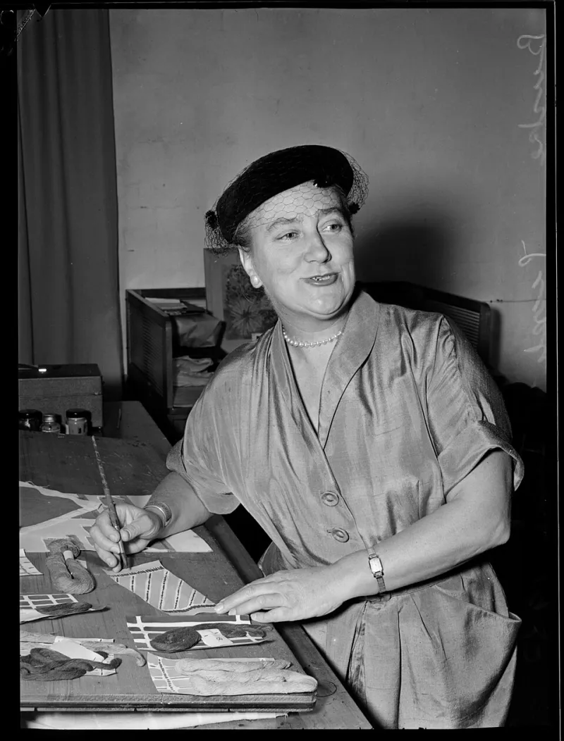
Photo: Gordon F. De Lisle, Public domain, via Wikimedia Commons
Open Coolors. Hit the spacebar a few times. Watch the palettes cascade past in a blur of muted terracottas, dusty sage greens, and warm off-whites. Eventually something catches your eye, you lock it in, and twenty minutes later you've got a color scheme for your project.
And so does approximately 40,000 other designers who did the exact same thing this week.
This is the quiet tension at the center of modern color work: we've never had more tools to help us find beautiful palettes, and we've never had a harder time making our color choices feel genuinely individual. AI-assisted tools, trend-forecasting algorithms, and platform-driven aesthetics have made it easier to land on good — but they've also made it easier to accidentally land on generic.
So how do you actually develop a color voice? How do you use these tools without becoming a product of them?
The Algorithm Is Working From Your Clicks, Not Your Gut
Let's be straight about what algorithmic color tools are doing. They're pattern-recognition machines trained on what has performed well — what's been saved, shared, liked, and purchased. They're optimizing for broad appeal, which means they're optimizing for the middle. The center of the Venn diagram where lots of people's tastes overlap.
That's genuinely useful information. But it's not the same as your taste. And it's definitely not the same as a color instinct developed over years of looking at the world and noticing what moves you.
Midjourney, Adobe Firefly, and similar generative tools have added a new layer to this. Describe an aesthetic in text, and you'll get imagery — along with implied color worlds that feel cohesive and appealing. But those color worlds are, again, statistical outputs. They reflect the aggregate of what's been created before, fed back to you in a new configuration.
Using these outputs as a jumping-off point is smart. Treating them as a destination is where things get flat.
When Trend Becomes Trap
Remember millennial pink? The color was everywhere from 2016 to roughly 2019 — on packaging, in coffee shops, across Instagram feeds. It was genuinely beautiful. It was also, by the end of its run, a visual cliché so recognizable it became a punchline.
Algorithm-amplified trends move faster now, and they spread wider. When a particular palette hits — the kind of muted, earthy, Pantone-adjacent color story that dominated brand design for most of the early 2020s — it doesn't just show up in design. It shows up in home goods at Target, in Etsy shop branding, in wedding decor, in app UI. The saturation happens faster than ever.
For working illustrators and designers, this creates a real strategic problem. If you build your visual identity around a trending palette, you risk looking dated the moment that trend peaks. And with algorithmic amplification, peaks come faster.
The designers with staying power tend to have a color sensibility that exists outside the trend cycle — something that reads as personal rather than seasonal.
Mining the Analog World for Digital Palettes
One of the most effective ways to develop a color voice that doesn't sound like an algorithm is to build your reference library from places algorithms aren't looking.
Take photos of things that stop you: the specific yellow-green of lichen on a rock in a Colorado hiking trail, the faded red of a vintage diner sign in rural Tennessee, the way certain afternoon light turns concrete a shade of warm gray that no Pantone chip has ever quite captured. These observations are yours. They're accumulated over the specific geography, culture, and emotional history of your life.
When you pull colors from these kinds of sources, you're not just getting a palette — you're getting a palette with a story. And that story is legible in the work, even if viewers can't articulate why it feels different.
Physical media can do this too. Flipping through old magazines, studying vintage textiles, or spending time with a museum's collection — the color relationships in a 1970s Sears catalog or a collection of Gee's Bend quilts are not going to come up in your Coolors recommendations. They're genuinely outside the algorithm's frame of reference.
Using the Tools Without Being Used By Them
None of this is an argument against using digital color tools. They're fast, they're genuinely helpful for checking harmony and contrast, and they can surface combinations you wouldn't have thought to try. The goal isn't to reject them — it's to use them as assistants rather than oracles.
A few approaches that tend to work well:
Start with your own anchor. Before you open any tool, pick one color that feels right for the project based on your own gut response. It could come from a reference image, a material, a mood. Then use tools to build around that anchor rather than letting the tool define the whole palette.
Break one rule per palette. Whatever combination the algorithm suggests, introduce one color that doesn't quite fit the expected harmony. A color that's slightly too saturated, or from a temperature that doesn't match the rest. This friction is often where things get interesting.
Steal from history, not from feeds. When you're looking for reference, deliberately go back in time. The color work coming out of 1960s American graphic design, or the palette sensibilities of Impressionist painters, or mid-century textile design — these are rich sources that are outside the current algorithmic feedback loop.
Limit your palette and get weird with it. Restricting yourself to three or four colors and then pushing them harder — using them in unexpected proportions, in unexpected contexts — often produces more memorable work than a perfectly balanced six-color scheme that plays it safe.
Developing a Signature Color Language
The illustrators and designers who develop recognizable color identities over time aren't usually the ones chasing trends. They're the ones who've spent enough time making work that their personal associations and instincts have crystallized into something consistent.
That consistency doesn't mean using the same palette over and over. It means having a sensibility — a way of seeing color relationships that shows up across different projects. Some designers have an affinity for unexpected complementary pairings. Others gravitate toward highly specific, slightly unsettling neutrals. Others work with color temperature in ways that feel cinematic.
These sensibilities develop through practice, through looking, and through paying attention to your own reactions. When a color combination in the wild makes you feel something, that's data. Log it. Build a visual archive that reflects your actual taste, not the distilled taste of the internet.
The algorithm can tell you what a lot of people like. Only you can tell you what you see.
And in a design landscape where the tools are getting more powerful and more uniform, the thing that makes your work worth looking at is still, stubbornly, the human eye behind it.